Shutter Speed
IN CLASS


Fast Shutter Speed :
The card shuffling picture is at 1/800th of a second. The ISO was 3200 and the white balance was set to fluorescent. The action that was captured was a snapshot of when Ms.Troutman was in the middle of shuffling cards. The cards are mid-bent while in the action of being shuffled. It was a close, low-view point of at an angle. The rule of thirds was used in the table because it rests on the bottom third. There is a variety of texture in the wooden table and the clothing. The use of selective focus helps emphasis the hands and cards from the background. In the same row as this picture, everyone of those pictures could be in a mini series because the appearance of the dice is apparent in all three pictures.
Slow Shutter Speed :
The second picture of the waterfall had an approximate shutter speed 1/15 of a second. The ISO was around 400 and the white balance was set to auto and probably used the cloudy setting. The water has been blurred and looks very smooth. I am within four feet of the waterfall and I am standing at a quarter-view point of view. Perspective is used due to the angle at which I took the picture. Texture is shown in the cement next to the waterfall and there is contrast between the textures of the hard cement and the soft water.
Painting With Light


Kaleidescope


Bokeh

Aperture


Image 1 is a shallow depth of field. The f-stop was f-9. The ISO was 1600 and the white balance was fluorescent. Image 5, the one with the dollars, shows a large depth of field. The f-stop was f-2.2. The ISO was at 32 and the white balance was set to incandescent. The shallow depth of field is better because it forces the viewer to look at the object that is in focus first and creates emphasis. A shallow depth of field is good for a photo with one subject or to focus in on one thing in the photo. A large depth of field is good for fast motion and crisp, clear images of things that are farther away.
Strongest and Weakest
|
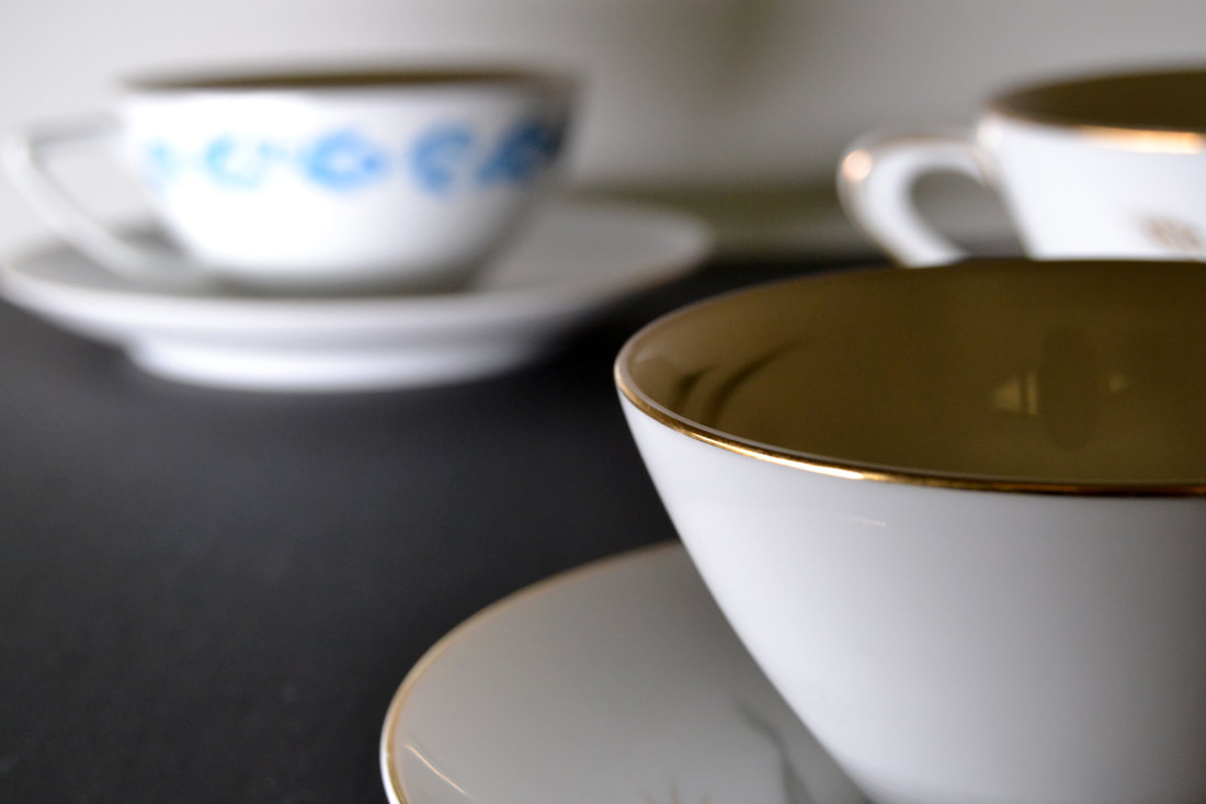
This is my strongest piece from a technical standpoint because the shallow depth of field is very much present while the closest teacup is in full focus. There is positive and negative space in the teacups and the black board they are sitting on. Perspective is warped with the distances of the teacups being different, creating a feeling of physical depth. The photo is in color but most of it is white and black with a refreshing pop of blue in the background on the leftmost teacup. the white balance was set on incandescent because I had a lamp to the left of the cups. This photo has a shallow depth of field because the closest cup is the clearest while the background and midground is blurred.
|
|
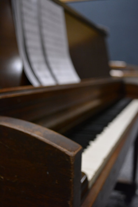
This is my weakest photo for aperture because there is nothing in focus so everything is blurry. It has leading lines, leading down and away from the piano. There is some contrast in the whiteness of the sheet music and keys compared to the dark blue background, black keys, and dark wooden piano. The perspective is interesting and gives the photo those leading lines. The white balance was set to fluorescent and the ISO was really high around 3200 because the PAC is so dark.
|
